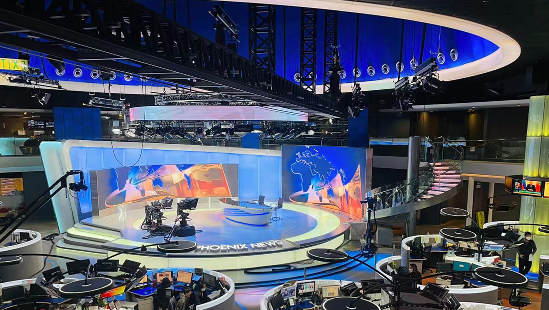
Phoenix Satellite Television Company is prepping an update to its newsroom studio in Hong Kong.
The overhaul replaces the network’s previous set, though most of the core structure and layout remain. The main anchor area now features a sleeker, updated riser and anchor desk. The riser is now much larger and buts right up against the walls and the multiple steps to the top have been eliminated around most of it. Instead, internally lit segments are featured both around the edges facing the newsroom workspaces and inside the surface of the platform.
Another addition is the network’s new logo installed as dimensional lettering along one edge of the riser.
While the previous set featured LED video walls, the installations have been significantly increased in size in this version of the studio.
The same cleaner look in the riser and desk has been applied to the scenic walls that wrap around the production space, with frosted backlit panels replacing the horizontal patterns.
The main wall is now contained inside of a frame that slopes slightly upward before making a quick curve and then continuing down to the floor, creating a sort of “sail” or “fin” like an outline that is also incorporated into the updated on set video wall maps graphics and shape and patterns of the anchor desk.
Overall, the creative direction moves significantly away from the horizontal line motif in favor of cleaner, more organic curves as well as references to the more “structured” shape of a simple circle.
With the elimination of the horizontally banded walls, the video walls are now freestanding with silvery sides hiding the unfinished backs of the panels.
The network also updated the LED halo ring above the anchor area, which also doubles as housing for lighting.
Meanwhile, many of the design’s original elements remain, including the ring-shaped workstations clustered around a column supporting a ring of TV monitors and suspended lighting.
The dramatic curved staircase and lit column element also remains.
Reference : Avinteractive


